
Pages that, thanks to graphic and numeric tiles, depending on the context of the data that has been selected in the tree view data, allow you to view a summary statement about the status of HSNM.
Tiles contain a title, a subtitle, a graph or textual information, numeric or tabular. The values they contain can be count, with the trend of the period selected by pressing the “Refresh” button in the command bar comparing the same number of days prior to the start date of the period or in real-time (CPU load, network traffic; RAM used; free disk space).
Composing the tile as a puzzle, are made of various types of dashboards: System, advertising, reseller, manager, domain, user, surveys, quizzes or tests.
In the System, “ The Reseller“, “ The Manager” and “ Domain” dashboard, the “” button allows displaying more tiles while the “” button allows reducing the number of tiles, speeding the uploading.
HSNM uses a caching system to limit queries to the database. The values of the tiles are updated after one day after the last query. By pressing the “Refresh” button at the top right, you force the data loading without using the cache and waiting one day. By pressing the “Refresh” button it also recalculates the values based on the chosen period.
It examines the various types of tiles that make up the dashboard.
Warning! The values depend on firstly by user role, and then from the context in which they appear. For example, if you click the “ System” branch, it shows the data of the entire system while if you point a reseller, it shows only the data that depend on the latter.
Warning! Currency values depend on the pointed branch: on ” System“, it considers the amounts to the administrator; on reseller discount values depend on connections and revenue share for advertising to him confidential; on a handler values depend on the discount on connections to him confidential; on a specific user, are considered sale prices.
The following is the list of types of tiles:
| Appearance | Description |
 |
The main chart
Advertising:
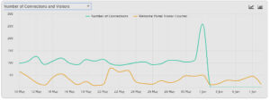
Connections
Data (MBytes)
Sales
System
Surveys
Users
Gateways (just for MiktroTik)
Access Points (just for MikroTik) The chart type can be selected by pressing the or buttons. Instagram has been maintained for compatibility with previous versions where it was still possible to log in with this social network |
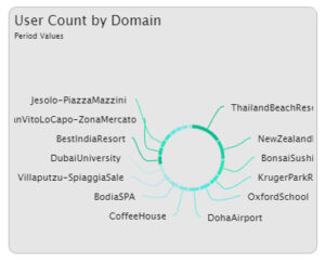 |
Number of users per domain |
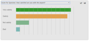 |
On the dashboard of the surveys, quizzes or tests, it counts the responses for every single question. |
| Users |
Number of users connected |
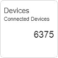 |
Number of devices connected |
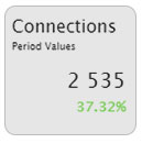 |
Connections The value is updated every four hours, in order to avoid heavy queries to the database that might slow down the system. |
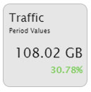 |
Traffic The value is updated every four hours, to avoid heavy queries to the database that might slow down the system. |
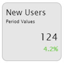 |
New users |
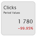 |
Clicks |
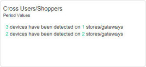 |
Users/Customers on multiple gateways |
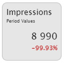 |
Impressions |
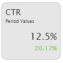 |
Clicks Through Rate |
|
Amount of not Activated Cards |
Amount of sales generated by cards not yet activated. |
|
Amount of not Activated Vouchers |
Amount of sales generated by vouchers not yet activated. |
|
Sales from other methods |
Amount of sales generated by payments made through payment gateways, assigned by backend, etc. |
 |
Total Sales Represents the sales amount during the selected period and percent trend compared to the same number of days that precede the start date of the period. |
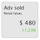 |
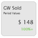
Sold advertising |
 |
Free/Total HDD Free and total hard disk space for data. Warning! With little space available for data there may be problems in database data, backups, restores, saving user traffic logs, etc. Real-time value. |
 |
RAM Real-time value. |
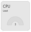 |
CPU Real-time value. |
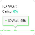 |
IO Wait A high value indicates that probably there are disk saturation problems. |
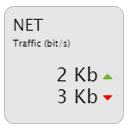 |
NET In the reseller dashboard, it represents the total traffic of the network interface card and not specific. In the PPPoE user dashboard, it displays the user data rate. |
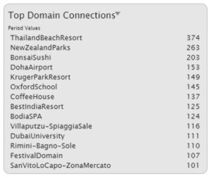 |
Top Domain Connections
Warning! The data per day of the week reproduced on a compressed period (in base to the value defined in “System Settings” in the “Keep detailed Logs for” field) are not correct because grouped. |
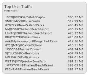 |
Users with the most traffic |
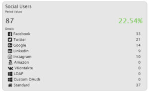 |
Social users In the details are shown the number of users who have been registered for each social network in the selected period. Scrolling with the mouse over the rows, it appears the trend percentage compared to the same number of days that precede the start date of the period. |
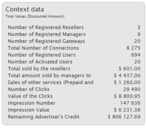 |
Context data |
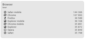 |
Browser |
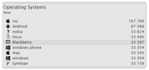 |
Operating systems |
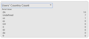 |
Count of the number of users per grouping of the selected period. |
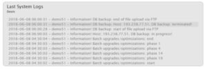 |
The last system logs |
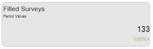 |
Filled out surveys, quizzes or tests |
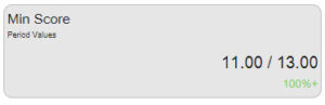 |
Minimum score of the selected survey, quiz or test |
 |
Maximum score of the selected survey, quiz or test |
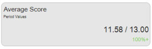 |
Average score of the selected survey, quiz or test |
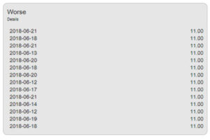 |
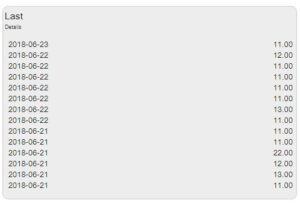
List of the worst results of surveys, quizzes or tests |
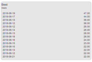 |
List of the best results of surveys, quizzes or tests |
 |
List of the last fourteen filled out surveys, quizzes or tests |